mosse
ROLE
UX / UI Designer
COURSE
Google UX Design
TOOLS
Adobe XD / Miro
prompt
Design an app for a virtual art gallery.
overview
Discourse is an essential ingredient of art, and the proof is visible in any gallery opening. When one engages with art in a social setting, a shared experience is cultivated, sometimes with kindred spirits and sometimes with people who view the world in radically different ways.
With our days filled with frequent challenges leaving us feeling depleted and drained, the collective experience of art presents an uncommon opportunity to grow as we gather and share.
client
The design proposal conceives of an imagined company, Mosse, which seeks to develop a platform that can marry the communal aspect of a gallery with the functionality of an art marketplace.
A dedicated mobile app is proposed as the product to realize Mosse’s goals:
to drive sales via connecting emerging artists to a global audience of buyers and supporters
to create a sense of community and belonging by providing a social hub for people to experience and discuss art together
to foster mutual benefit to artists and patrons via the cross-pollination of commerce and social networks
problem
Galleries provide us with a setting for the shared experience of art, thereby including us in their creative communities. This opportunity for engagement, however, is often linked to status and cities and remains less accessible for many.
vision
Mosse is an app that fuses the convenience of an online art marketplace with the curation and social component of a gallery. The platform grows relationships between artists and patrons translating into meaningful social connection and greater business.
goals
promote
Support emerging artists and expand their visibility in the art community
engage
include
Create a more inclusive and accessible way of viewing art
connect
empathize
How can we best serve the needs of our target audience? First we need insight into their behaviors, goals, and preferences.
User interviews were conducted to to help determine how user preferences can affect the process of enjoying and buying art. 8 participants were asked 10 questions.
what deters you from visiting a gallery?
what motivates you to visit a gallery?
aside from cost, what is most important when purchasing art?
what encourages you to try new brands, products, + activities?
62.5%
an intimidating scene…
of people have felt intimidated or unwelcome in a gallery environment
75.0%
a chance to connect…
of people were motivated by the chance to engage with artists and fellow art lovers
62.5%
artist loyalty…
87.5%
a trusted advisor…
meet the users
ayana

"Art has a unique ability to make me find a piece of myself in something otherwise unfamiliar"
Age
Occupation
Location
Status
Goals
Purchase original artwork for her new home
Discover new emerging artists
Connect with fellow art lovers
Frustrations
Overwhelmed with the amount of artwork to browse through online
Local galleries feel elitist instead of welcoming
Lack of diversity in current online art shops
user flows
ayana
Ayana’s path for purchasing a piece of art and following the artist. The diagram highlighted the need for a catalyst for discovery, leading to the integration of an art matchmaker feature.
information
architecture
By consolidating the interface into five core sections, users can seamlessly switch between shopping and exploration modes, connecting with art they love and boosting business for the artists.

wireframes
These initial layouts follow the structure established in the IA diagram and take advantage of the lessons learned in the competitive audit.

prototype
Wireframes were then translated into a low-fidelity prototype to give a basic idea of the product's appearance and behavior. One of the big visual moves is the implementation of a neutral color palette, with white backgrounds for the marketplace and dark grey backgrounds for social functions.

testing
How easy it is for users to complete core tasks? The prototypes were used to facilitate a usability study focusing on three scenarios:
Task A: Locate a painting that costs between $500-$2000, add it to your bag, and select check out
Task B: Open the “calendar” section, locate the collaboration between artists “b” + “c” and add the event to your calendar
Task C: Open the “browse” section, select a piece by artist ‘b’, and send them a direct message
In Control
The ability to filter the search via price was effective but users requested additional parameters including consideration of artwork size.
Make it Clear
Users had to read all of the text to identify which events were special collaborations. The UI should ensure that notable features like this are immediately apparent .
Too many clicks
Users struggled to find the message button. Burying this in an overlay complicates navigation and reduces the potential of making connections.
redesign 'a'
User feedback from the usability study served as the basis for the next round of design iteration.
Issue: Users wanted to be able to filter artwork by size
Solution: Additional filter options were added to ensure users can find what they are looking for and the search feature moved to the main screen for easier browsing
early iteration
redesign
redesign 'b'
Issue: Users had to rely on text to identify events involving artist collaborations
Solution: Imagery was reconceived and iconography was added so that users would immediately understand the nature of each event
early iteration
redesign
redesign 'c'
Issue: Users struggled to locate the “message the artist” button
Solution: The feature was removed from the overlay and applied directly to the page showcasing the artist’s work
early iteration
redesign
goal check
promote
The app augments the base function of buying art with opportunities to connect directly with artists and curators. These personalized interactions have reciprocal benefits. Users are provided with customized assistance to help discover artwork they love while artists are able to build relationships that support their growing businesses.
engage
Mosse’s UX enables users to discover art they love. Mosse’s matchmaker feature applies the framework of a dating app to the retail experience. Users "swipe right" on art that speaks to them, helping build their profiles over time. The UX emphasizes preferences defined by the users but always leaves the door open to explore other possibilities.
include
The third goal was to create a more inclusive and accessible way of viewing art. The home page provides a curated art collection personalized to user preferences, helping them discover new artists and make connections. The app also provides virtual gathering spaces where users can engage in live events and share their perspectives.
connect
The fourth goal was to foster long-term relationships with our users, facilitated through the role of the curator. Users can browse and follow curators, benefitting from their expertise and recommendations. The IA ensures easy access to their assistance, organizing data like artwork, shared contacts, and messages by curator. These connections personalize the user experience and help build authentic relationships.
the product
Scroll through the images below to see the final prototype, a marriage of commerce and community.
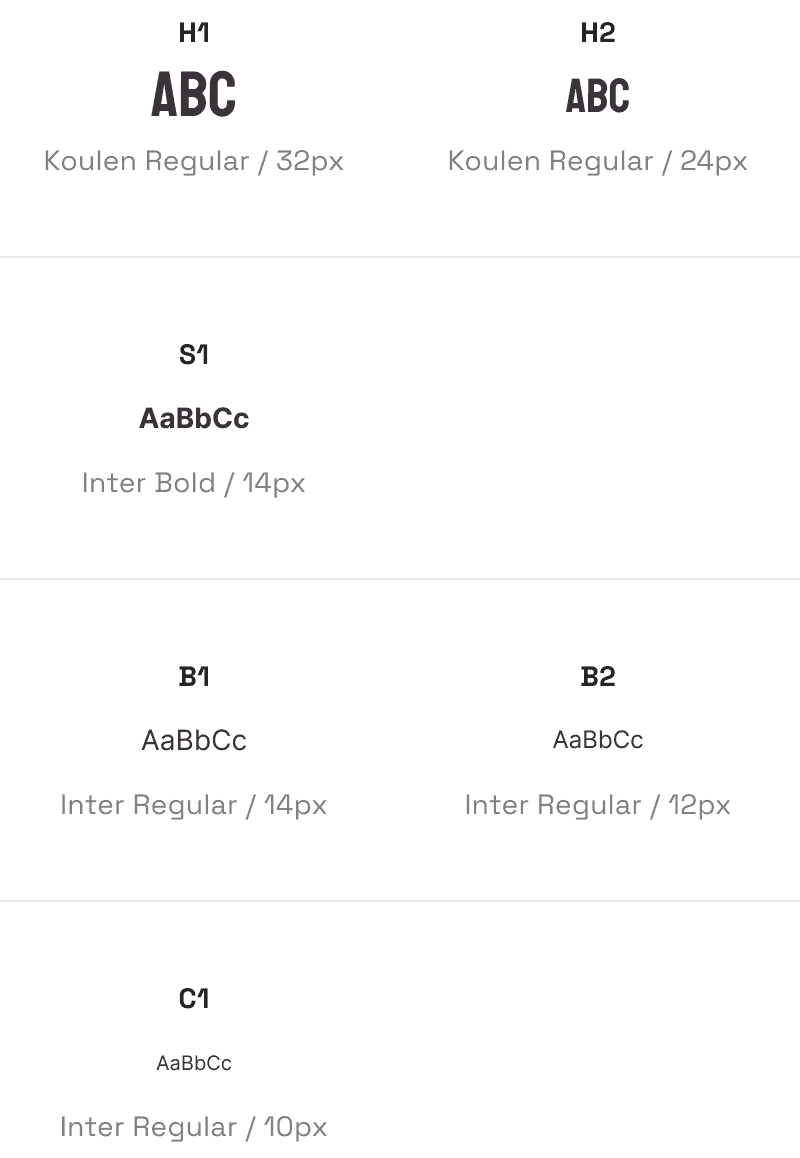
I developed a minimalist design system to ensure consistency across the app and keep the focus on the art.
color palette
tonalpalette
typography
next project
like a curator!


