Responsive Website in Support of Ethical Tourism
ROLE
UX / UI Designer
COURSE
Google UX Design
TOOLS
Figma / Miro
prompt
Design a cross platform tool to support collective social good.
overview
Traveling is more than just exploration. Its offerings come by way of authentic encounters that can impact us long after a trip has ended. Across Asia, elephants serve as the keystone of the tourism industry. Sadly, the "once in a lifetime experience" of an up-close encounter with an elephant translates to these sociable creatures becoming victims of a trade that exploits them by the thousands. The focus of this exercise is to create a cross platform tool to support ethical elephant tourism and help save the Asian Elephant.
client
The design proposal conceives of an imagined non-profit association, the Asian Elephant Rescue, which advocates for the conservation of the Asian Elephant and is looking for a means to expand its reach.
A responsive website is proposed as the instrument to scale impact for AER's mission:
to raise awareness of the plight of the Asian Elephant
to protect the future Asian Elephant population via the transformation of the elephant tourism industry
to rescue and provide sanctuary for elephants subjected to the brutality of the tourism industry
problem
Globetrotters want to punctuate their travels with extraordinary experiences. The Asian market is flooded with options offering close elephant encounters, but it’s difficult to determine which activities promote responsible tourism and protect animal welfare.
vision
AER’s website will help users plan a once-in-a-lifetime elephant encounter in a responsible way. This benefits both travelers and elephant conservation efforts by granting visitors memorable experiences while also contributing to the greater cause.
goals
educate
Educate users on the problematic conditions of elephant tourism
empower
connect
Create an interface capable of motivating people to care about elephants
simplify
empathize
How can we best serve the needs of our target audience? First we need insight into their behaviors, goals, and preferences.
User interviews were conducted to to help determine how user preferences can affect the process of enjoying and buying art. 7 participants were asked 12 questions.
what do you know about elephant tourism in Asia?
how do you decide what activities to do when planning a trip?
when has online content triggered an emotional response?
what motivates you to donate to a cause?
85.7%
an unseen problem…
of participants were unaware of the mistreatment of Asian Elephants which is a byproduct of the tourism industry
71.4%
an opportunity to educate…
of respondents indicated they research destinations and select activities that match their interests and constraints
85.7%
a deeper connection…
57.1%
a visible impact…
meet the users
curran

"the best part of travel is immersing oneself in new environments"
Age
Occupation
Location
Status
Goals
Have memorable experiences
Book a tour to visit and interact with elephants
Travel responsibly
Frustrations
Overwhelmed by the amount of travel information to filter through
Has difficulty discerning which organizations adhere to responsible wildlife practices
user flows
curran
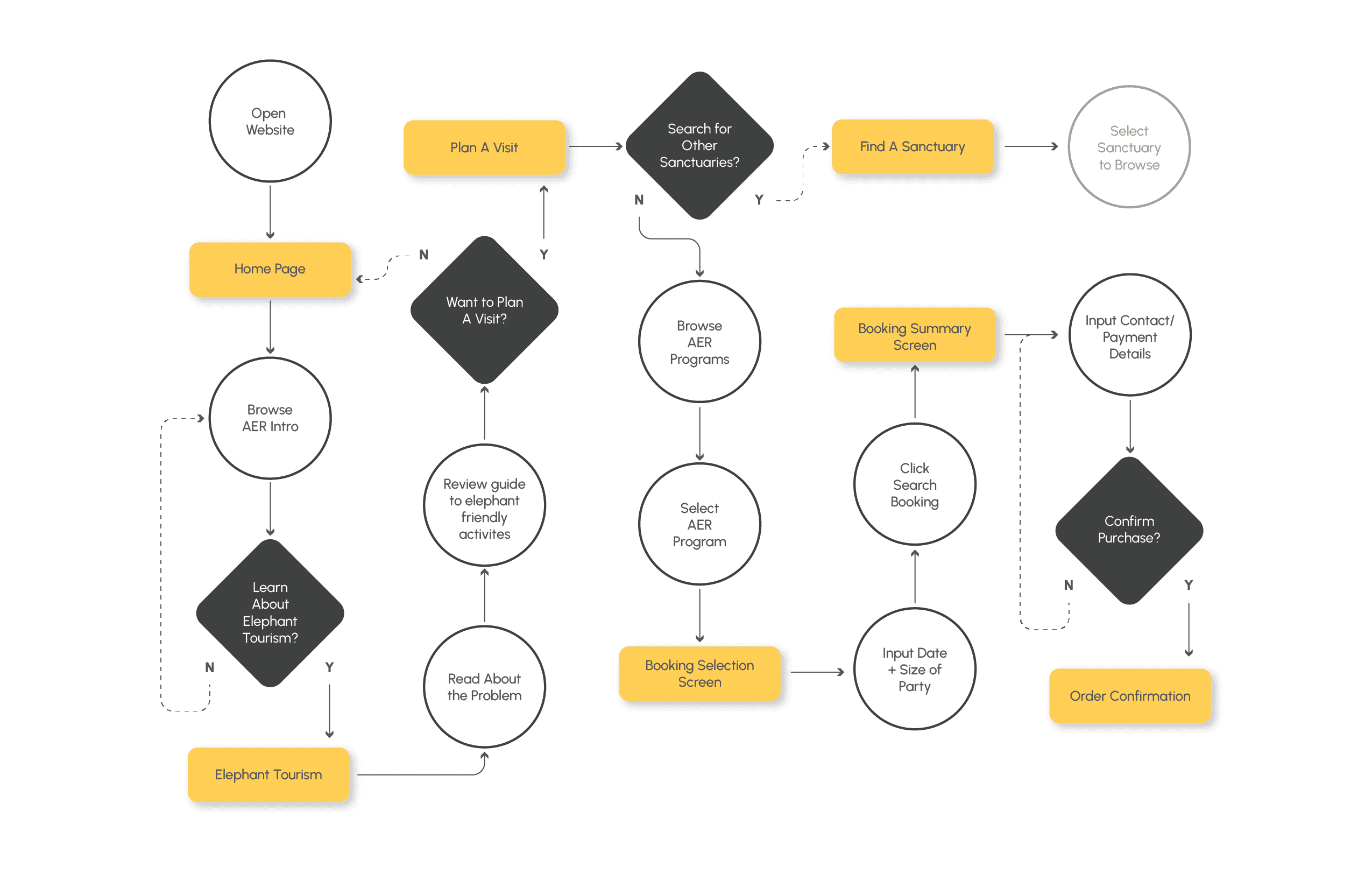
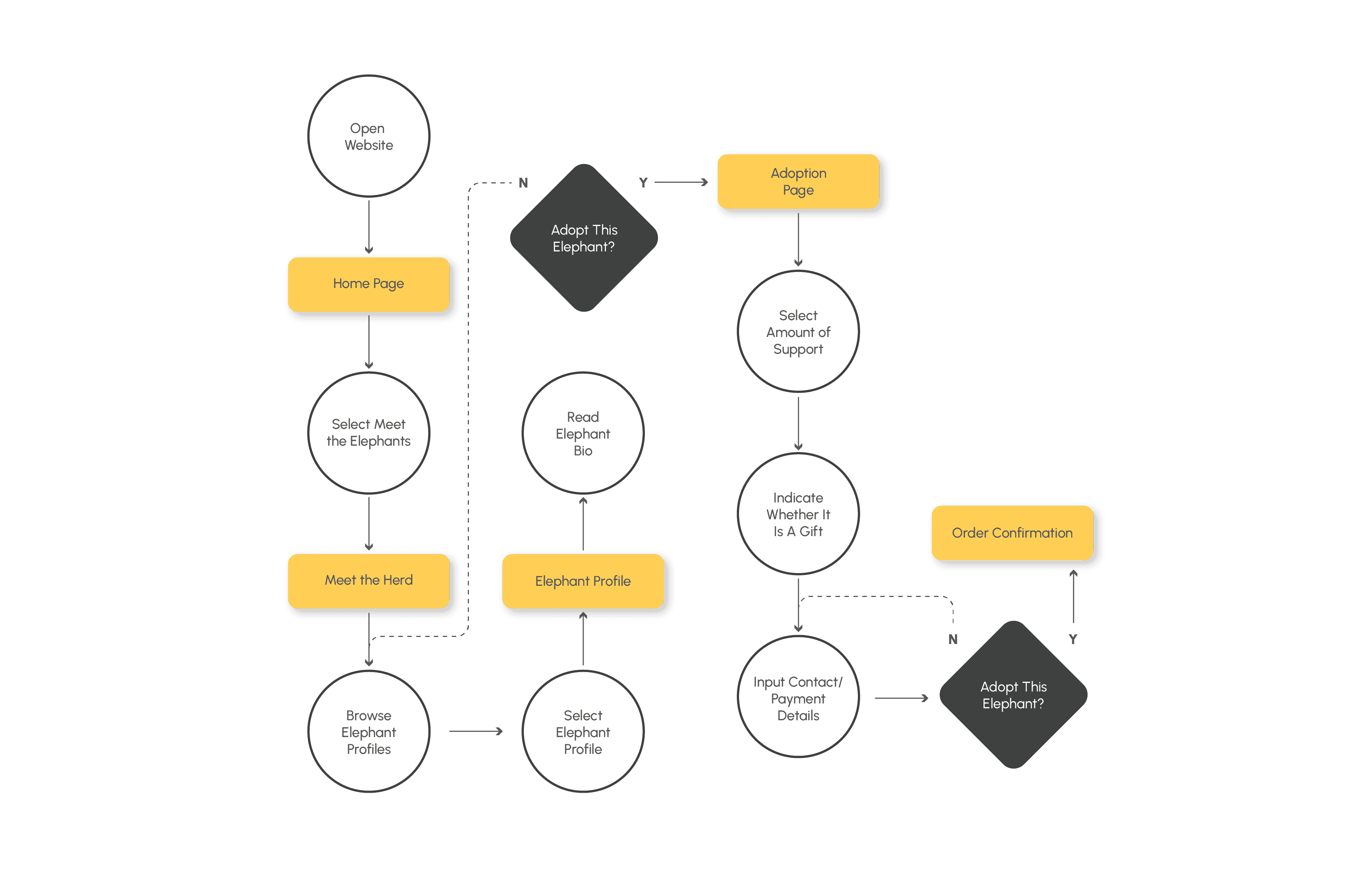
Curran’s user flow follows steps from logging in to booking a responsible elephant tour with AER. The diagram highlighted critical points where Curran interacts with the site, allowing him to first discover information before finalizing a booking.
information
architecture
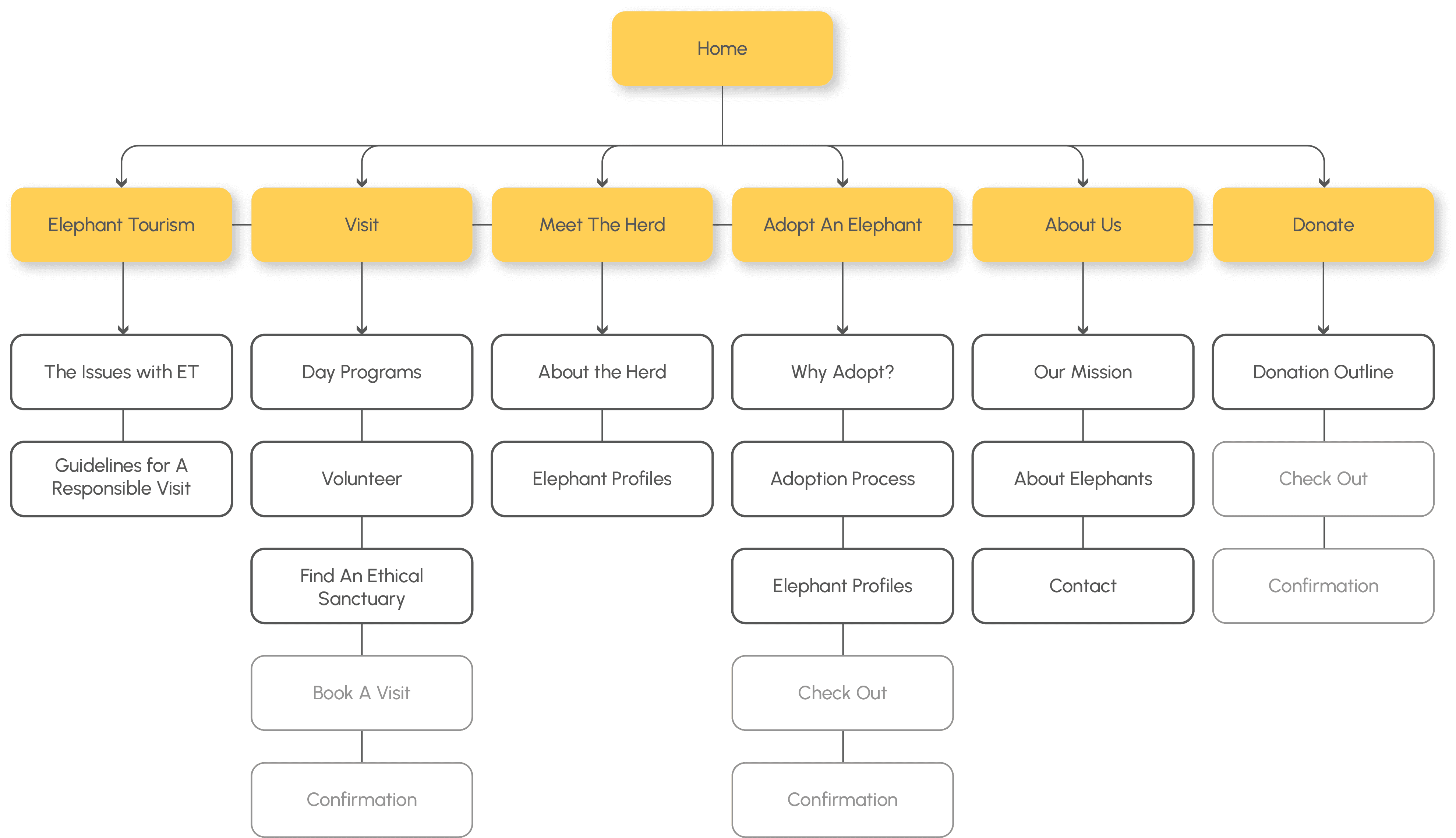
This sitemap focuses on six core sections aligned with the project goals. The 'Elephant Tourism' and 'Plan a Visit' sections educates users and empowers them with information. 'Meet the Herd,' 'Adopt an Elephant,' and 'About Us' connect visitors to the elephants and the cause. Finally, the 'Donation' section provides a clear path to support the organization.
wireframes
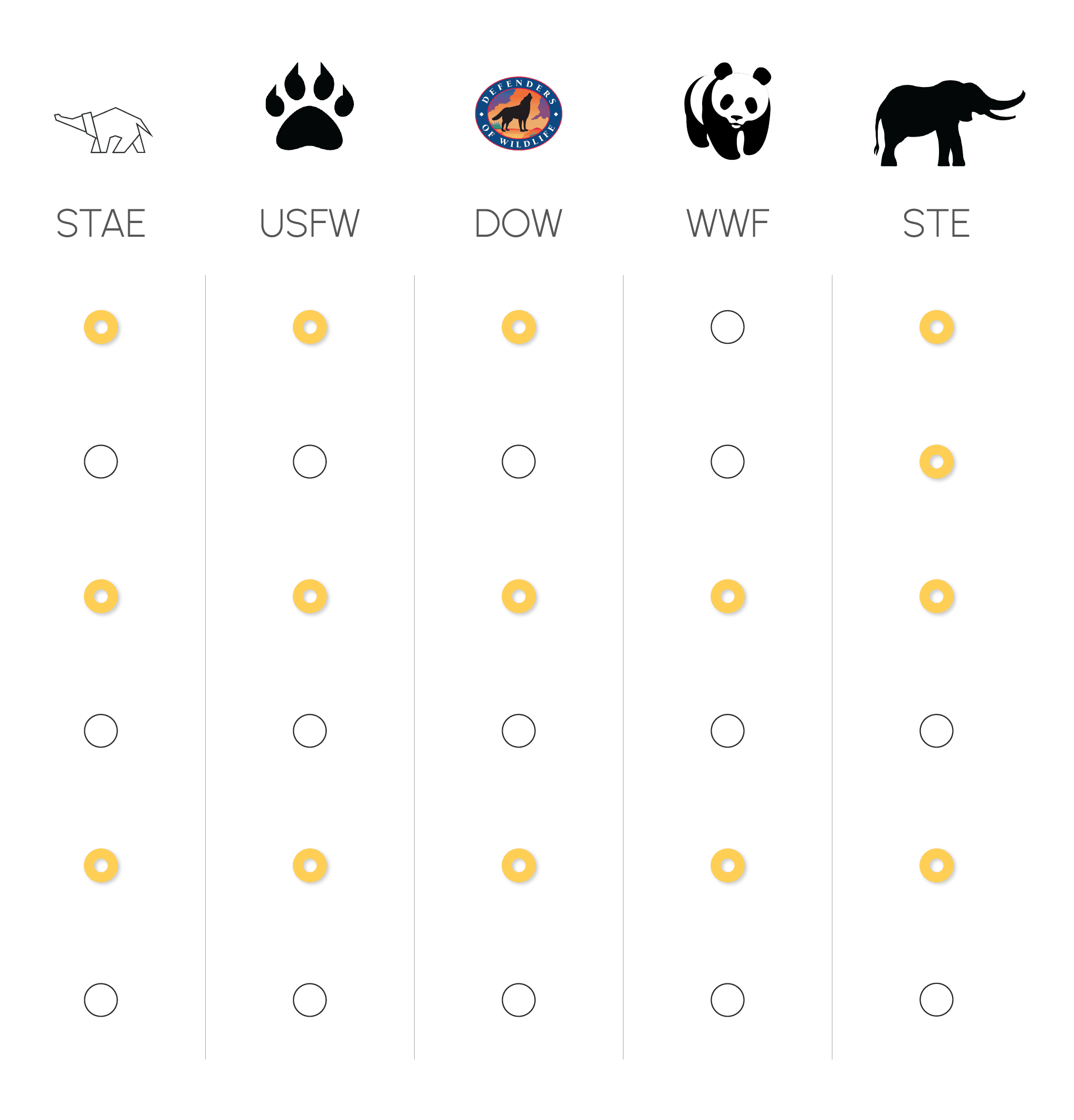
These wireframes showcase the initial layout for the site's key sections, informed by the IA diagram, interviews and competitive audit. The IA is reflected in the top menu bar, and powerful hero images are incorporated to capture visitors' attention.

prototype
Wireframes were then translated into a low-fidelity prototype to give a basic idea of the product's appearance and behavior. A key feature throughout is the use of concise text summaries that highlight main points in a digestible format, delivering critical information without overwhelming users with lengthy narratives.

testing
How easy it is for users to complete core tasks? The prototypes were used to facilitate a usability study focusing on three scenarios:
Task A: Participant to locate guidelines for a responsible visit with elephants
Task B: Participant to complete the process of adopting an elephant
Task C: Participant to submit a $20 donation
Clearer Navigation
Users struggled to find guidelines for ethical visits, emphasizing the need for improved navigation.
Simplify
The separation of adoption info from “Meet the Herd” confused users, as they expected these to be part of a cohesive narrative.
More Options
Users desired more customization options in the donation process to better suit their preferences.
redesign 'a'
User feedback from the usability study served as the basis for the next round of design iteration.
Issue: Info on finding ethical sanctuaries lives below the fold making it more difficult to find.
Solution: Collapsible menus allow for quick wayfinding throughout the site.
early iteration
redesign
redesign 'b'
Issue: Users were looking for the adoption info to be closer to the "meet the herd" section to help facilitate the adoption process.
Solution: Consolidation of the two sections simplified the UX.
early iteration
redesign
redesign 'c'
Issue: Users would have taken advantage of a recurring option if made available in the donation process.
Solution: Options were added to a for monthly and annual donations.
early iteration
redesign
goal check
educate
The website achieves this by delivering balanced information through brief outlines and attention-grabbing graphics, while also offering detailed content via links for those seeking more in-depth knowledge. This strategy keeps the UI clear and uncluttered, ensuring effective knowledge transfer.
empower
The UX presents easily digestible data, highlights preferred destinations, and uses bullet points to identify red flags for non-listed locations. This drives proactive exploration and informed decision-making.
connect
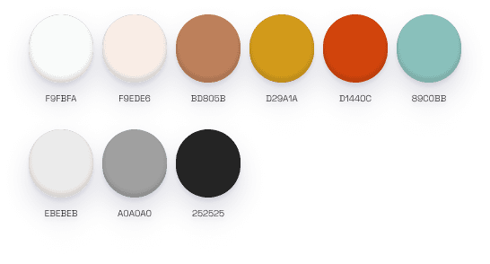
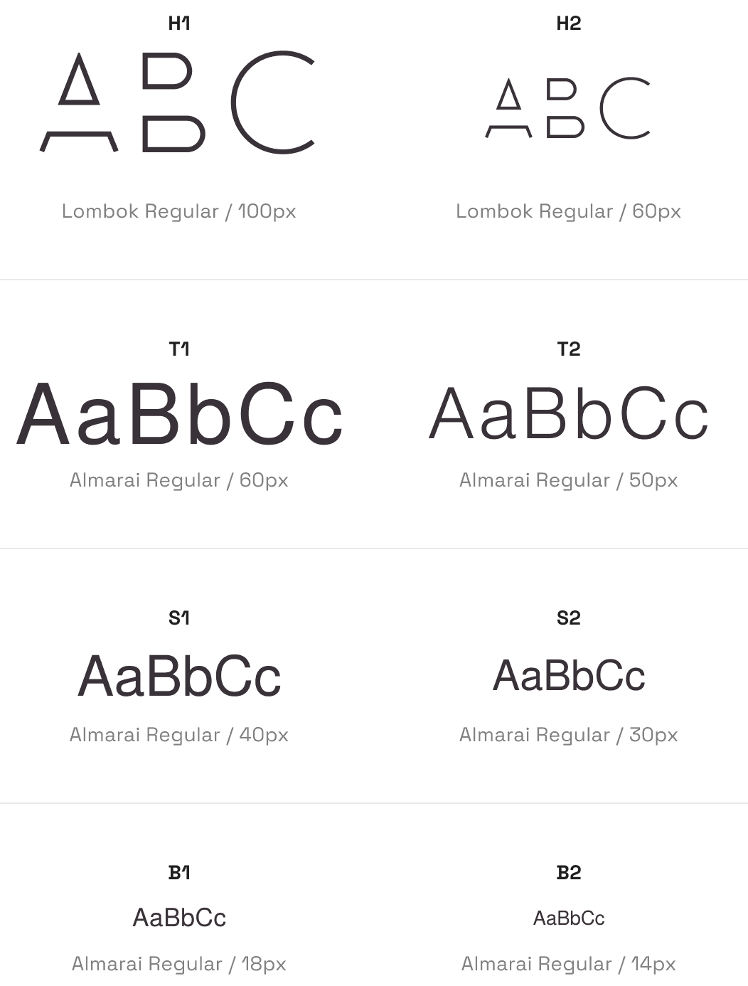
The third goal was to forge a deep connection between users and elephants. The UX uses captivating hero images, engaging fun facts, and detailed animal bios to foster a sense of kinship with the animals. Playful typography and earthy tones were chosen to vividly evoke the elephants' natural habitat, making the experience immersive and memorable.
simplify
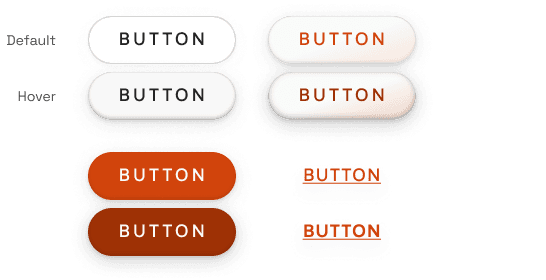
The UX reinforces the donation process as a main priority. Bright-colored "donate" buttons are created to be distinct elements punctuating each page. The user path is reduced to the fewest clicks possible, and simple, customizable controls show users exactly how their donations will provide aid, enhancing transparency and user engagement.
the product
Wireframes were then translated into a low-fidelity prototype to give a basic idea of the product's appearance and behavior. One of the big visual moves is the implementation of a neutral color palette, with white backgrounds for the marketplace and dark grey backgrounds for social functions.
responsive
To ensure the website's responsiveness across multiple devices, the design was adapted for various screen sizes, use cases, and navigation strategies. This guarantees a seamless and intuitive experience for all users, regardless of their device.
The design system features a playful logo, high-contrast buttons, and a color palette that blends earthy tones with vibrant pops of teal, evoking the natural hues of the elephants’ habitat.
color palette
buttons
typography
logo


